 F12 Labs
 Aedify
Aedify documentation / Build pages
Using the builder
A tour of Aedify's builder: the palette, the canvas and its element toolbar, the settings drawer, keyboard shortcuts, preview, full screen, saving, and the notices you may see.
Every page, blog post and description you design in Aedify opens in the same builder. This page walks through each part of it, so you know where everything is before you start building.
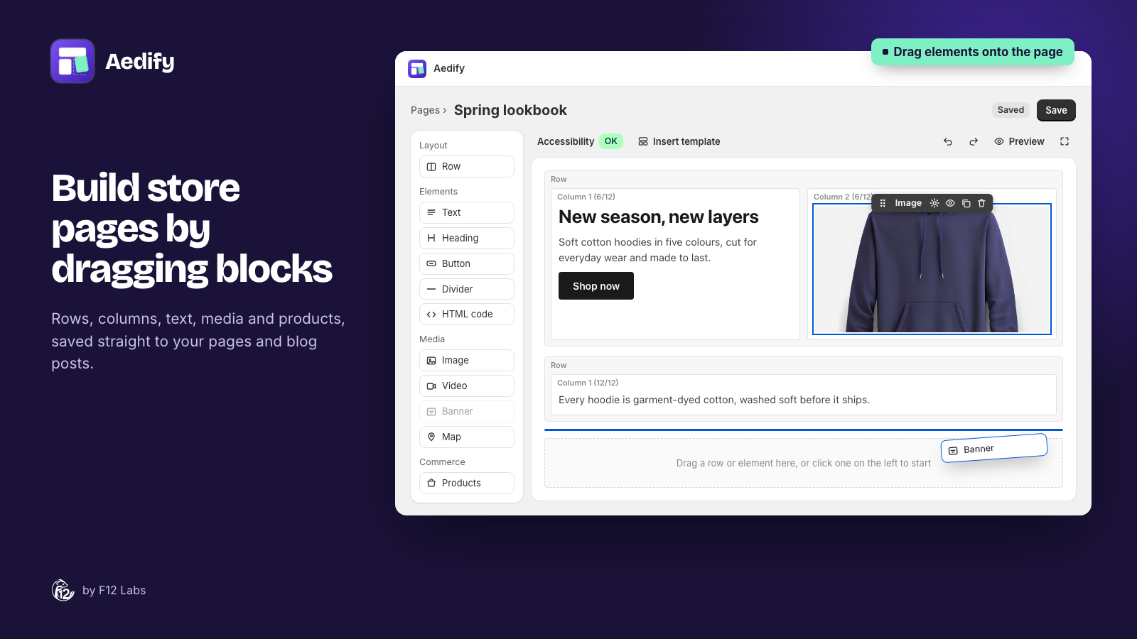
The parts of the builder
- The header has a breadcrumb back to the list, and Save. For a page or blog post it also has the Title and the Visible on storefront checkbox. For a product or collection it shows which item you're editing, with a button to open it in Shopify.
- The toolbar above the canvas holds the accessibility check, Insert template, undo and redo, Preview, and full screen.
- The palette on the left lists everything you can add.
- The canvas is your page, laid out as rows and columns.
- The settings drawer slides in from the left when you open an element's settings.
Adding elements
The palette groups elements the same way every time:
| Group | Elements |
|---|---|
| Layout | Row, Template |
| Elements | Text, Heading, Button, Icon, Divider, HTML code, Accordion, Tabs |
| Media | Image, Video, Banner, Map |
| Commerce | Products, Collections, Blog posts |
There are two ways to add one:
- Drag it onto the canvas. A line shows where it will land.
- Click it, and it's added next to whatever you have selected.
On an empty page, the canvas says "Drag a row or element here, or click one on the left to start".
Rows hold columns, and columns hold elements. Tabs and accordion items can hold rows of their own, so you can put a full layout inside a tab.
Working with elements on the canvas
Click an element to select it. Hover over it to see its toolbar:
| Toolbar item | What it does |
|---|---|
| Grip (Drag to move) | Drag the element somewhere else on the page |
| Add tab / Add item | On Tabs and Accordion: add another tab or item |
| Settings | Open the element's settings drawer |
| Hide on storefront / Show on storefront | Keep the element in the page but hide it from shoppers. Useful for seasonal content. (Not on columns) |
| Duplicate | Add a copy right after it |
| Delete | Remove it |
Text and headings are edited right on the canvas: click into them and type. A selected heading has a small toolbar to change its level (H1 to H6) and alignment. Text elements have a full editor in their settings, with fonts, sizes, colors, lists, links, inline images and icons, and an HTML view.
The settings drawer
Settings opens a drawer with everything for that element: an image's alt text, a button's link, a row's columns. Below the element's own settings are two collapsible sections that every element has:
- Style: margins and padding for each side, background, text color, font size and weight, border, corner radius, minimum height and custom CSS. Leave a box empty for the default; a plain number means pixels.
- Advanced: Hide on storefront, CSS classes and an Anchor ID, for linking to that spot on the page (
/pages/about#team).
Click Done to close the drawer.
Keyboard shortcuts
| Keys | Action |
|---|---|
| Cmd/Ctrl + Z | Undo |
| Shift + Cmd/Ctrl + Z | Redo |
| Enter or Space | Select the focused element |
| Delete or Backspace | Remove the selected element |
| Alt + ↑ / ↓ | Move the element up or down |
| Alt + ← / → | Move a column left or right |
Tab moves between elements on the canvas, so you can build without a mouse.
Preview
Preview shows the page at three widths:
- Desktop: full width
- Tablet (820px)
- Mobile (390px), where columns stack
The preview uses a neutral system font rather than your theme's, so it's for checking layout, not the final look. To see the page exactly as shoppers will, save it and open it on your store.
Full screen
Edit in full screen opens the builder in a full-screen window, with more room for the canvas. Changes you make there carry through to the page behind it. Click Exit full screen to go back. A few things, like editing a placed template, ask you to leave full screen first.
Saving
Nothing changes in Shopify until you save. While you work, a badge next to the title shows Unsaved changes, Saving… or Saved. To save, click Save at the top, or use Shopify's save bar, which also offers Discard to throw away your changes.
Saving writes the layout into the page's own content in Shopify. You can see it in Shopify's page editor too, but edit it in Aedify, which keeps it in a shape the builder can open again.
Notices you might see
"This content was created outside Aedify." The page, post or description was made in Shopify's editor (or another app). Aedify turned its headings, text, images and videos into elements, and kept anything else as HTML code. Choose Keep as one HTML block to leave it exactly as it was instead, or Convert to elements to switch back. Nothing changes in Shopify until you save.
"This content was changed in Shopify since Aedify last saved it." Someone edited the page outside Aedify. Their changes are loaded into the builder. Check them before you save.
"…was saved somewhere else since you opened it. Reload to get the latest version." Someone else saved the same page while you had it open, so Aedify stopped your save from overwriting theirs. Reload the page, then make your changes again.
"Aedify styles are off in your theme." The Aedify styles app embed isn't turned on, so layouts won't look right on your store. Turn on in the theme editor fixes it.
"Products, collections and blog posts need the Aedify content block." The page uses a live element, and the template it shows on doesn't have the Aedify content block yet. Add it in the theme editor opens the right template.
Check accessibility before you publish
The Accessibility button in the toolbar checks the page as you build, against WCAG 2.1 AA. It reads Accessibility: OK when there's nothing to fix, or counts the errors and warnings it found. Open it to see each issue, such as an image without alt text, an empty heading, or text that's hard to read on a banner. Select next to each issue takes you to the element.